There’s a moment every good game shares: the moment you do something without thinking and it works.
You didn’t read a tooltip.
You didn’t pause to ask “what does this button do?”
You just did it. And it clicked.
That’s not instinct. That’s interface design done right.
📜 Tutorials Are a Symptom of Failure

Most UI (User Interface) design is reactive. You build something, and when people get confused, you slap on a pop-up that says “Press B to Cancel.” This works. But it’s like putting a tour guide in a maze instead of just… removing the dead ends.
If your game needs a tutorial, the UI already failed. It doesn’t matter if it’s a glowing button, an elegant menu, or a hyper-minimalist dot grid, it failed to teach itself through use.
Great UIs don’t teach you how they work.
They let you teach yourself.
🧠 Muscle Memory > Memory Memory
When you reach for the inventory button in Dark Souls, or hotkey your spells in Noita, you’re not recalling a lesson, you’re recalling a feeling. Your hands remember what your eyes were never told.
That’s the end goal of UI:
-
Not to inform,
-
but to embed.
Anything that requires you to stop and think becomes a design bottleneck. It pulls you out of the loop, forces you to shift cognition modes from “acting” to “interpreting.” That’s death, especially in real-time games.
🕵️ Examples You Don’t Notice (Because They Work)
-
Half-Life 2’s gravity gun: No onscreen tutorial needed. You point, you pull, you throw. The physics themselves are the interface.

-
Breath of the Wild: It doesn’t teach you how to cook, but it quietly nudges you through shape, slot, and sound.

-
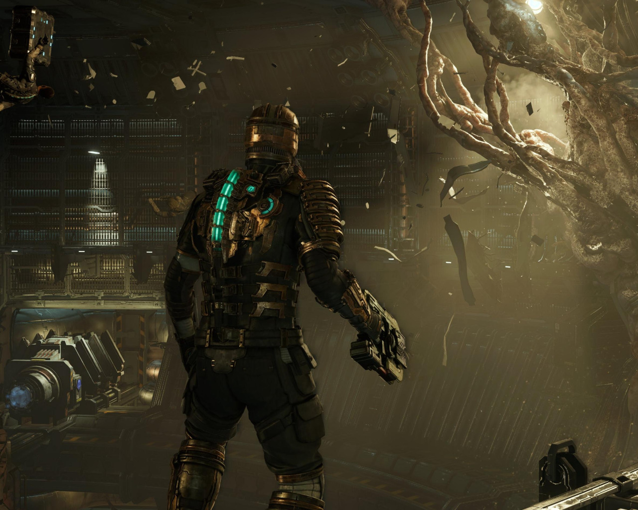
Dead Space’s UI: It’s in the suit. Health is your spine. Ammo floats near your gun. No HUD, just you and diegetic data.

These aren’t “simple.” They’re invisible. And that’s the point.
🪓 When It Goes Wrong

Contrast that with something like Path of Exile. Incredible systems. the UI however; Skill trees the size of a city, inventory like a Tetris crime scene, 50 currencies, all sitting on a brittle UI that begs for a wiki (very unfair comparison, I know).
You’re not learning through doing.
You’re studying like it’s a university exam.
The interface is a wall between you and the game.
🔚 Minimalism Is Not the Answer Either
Just to be clear: invisible doesn't mean nonexistent. A UI that hides everything and expects you to guess is just as broken.
Good UI isn’t minimal.
It’s intuitive.
It speaks in action, not words. In outcomes, not explanations.
If you want to check your HP and end up wondering what an "aura orb threshold" means, the interface just made itself the main character. That’s not UX design. That’s Stockholm syndrome for MMO players.
TL;DR (But You Just Read It, Didn’t You?)
-
A good UI doesn't tell you what to do.
-
It lets you discover what you can do.
-
And once you feel how it works, you never have to ask again.
com
full time NPC, part time ByteBloomer software developer